 7WEVS
7WEVSData & AI Animation Academy
208 hard ideas. Each one a short animation.
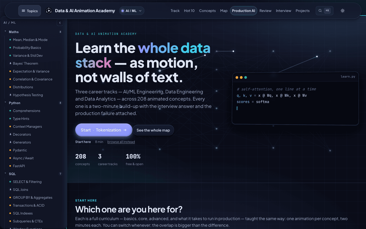
A free, interactive lab that teaches AI/ML engineering, data engineering and data analytics through animation.
- Type
- Free learning product, live
- Role
- Curriculum, animation, design and development
- Stack
- Vite, JavaScript, GSAP, Canvas, Vercel
The need
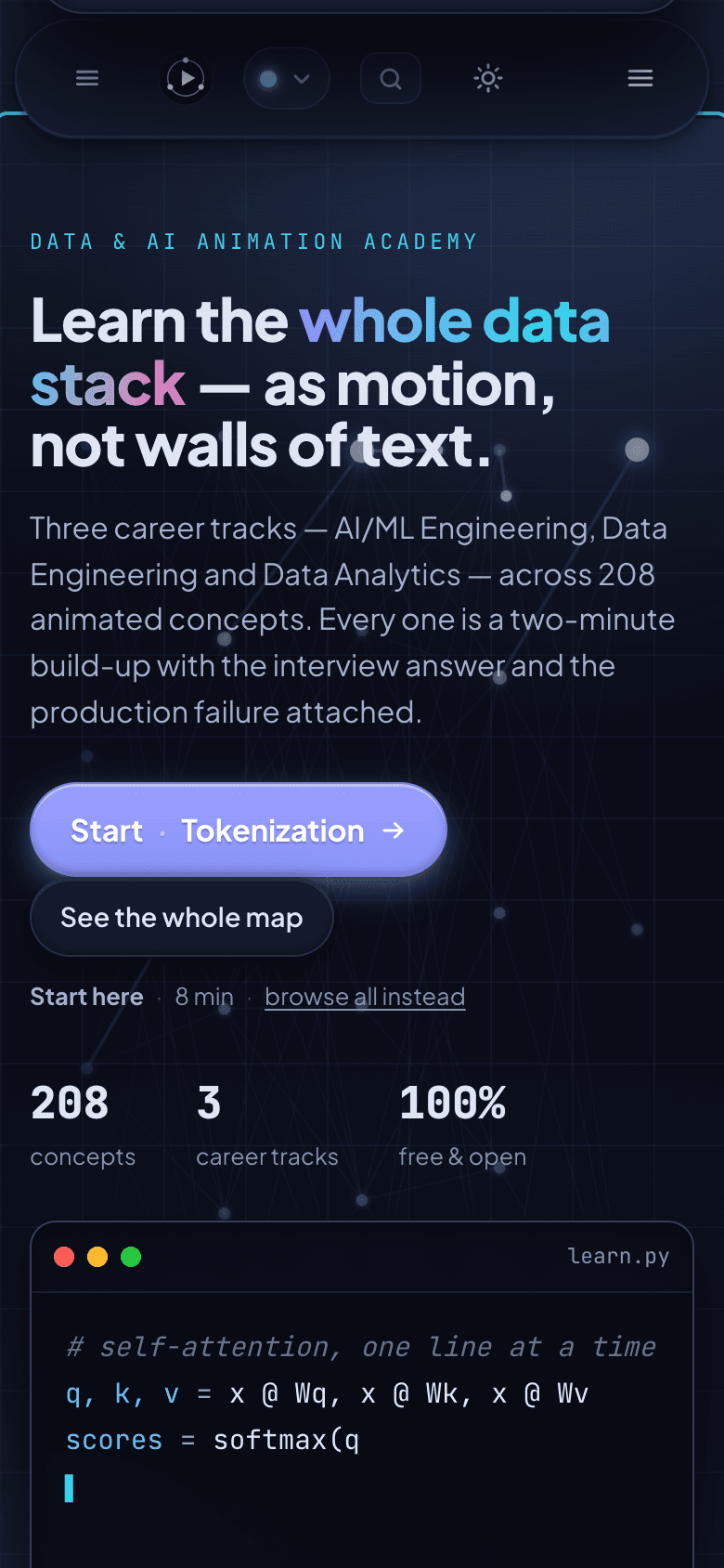
People learning data and AI are buried in long articles and longer videos. They need to see one idea move, understand why it works, and know how it breaks in production, in a couple of minutes.
What we built
Three animated career tracks, a dependency-ordered curriculum map, interview answers and production notes for every concept.
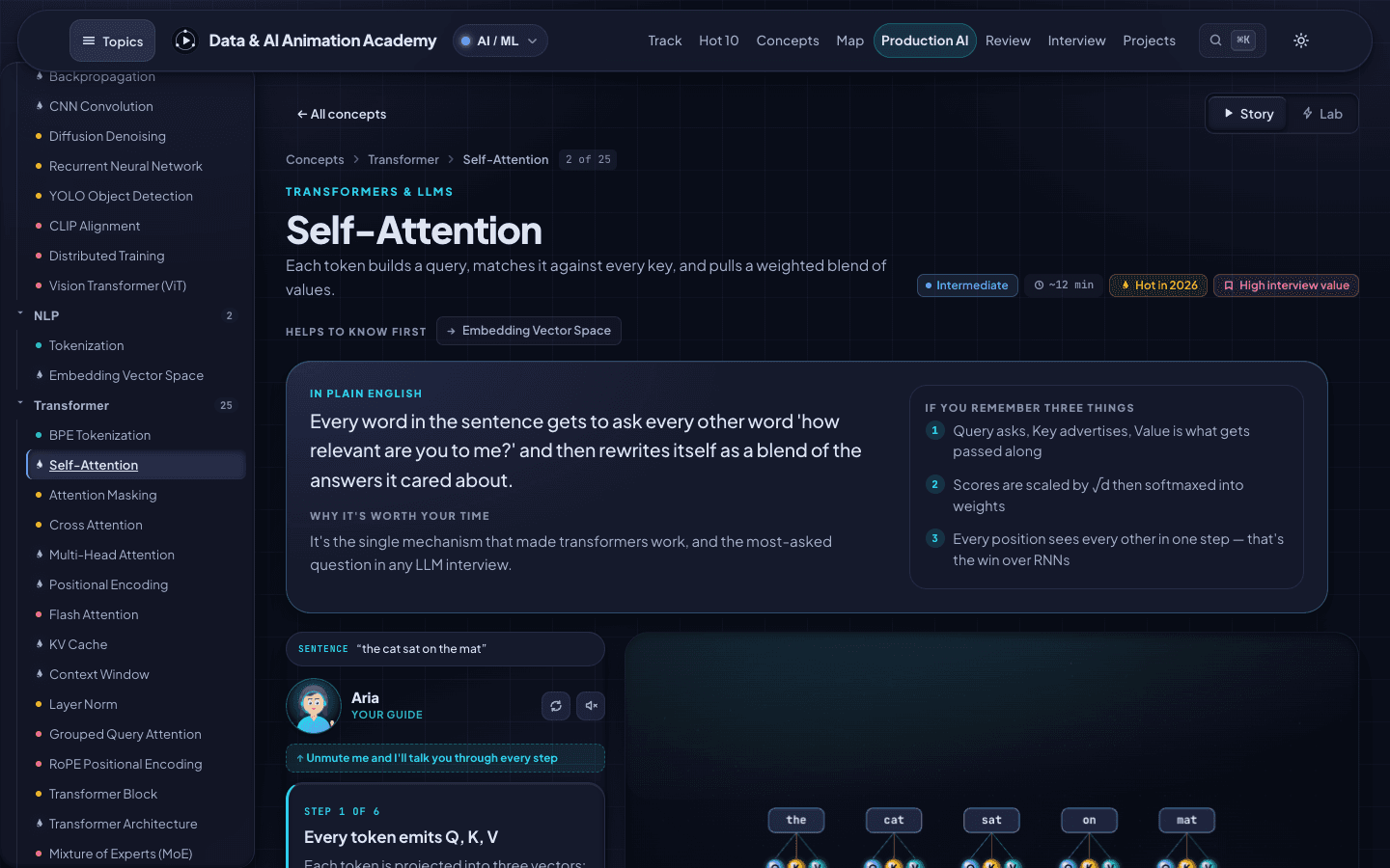
One concept, one animation
Every concept is a short animated build-up, about two minutes, with the interview answer and the production failure attached.
Three careers, one library
AI/ML engineering (157 concepts), data engineering (50) and data analytics (37). The tracks share what they have in common, 208 concepts in all.
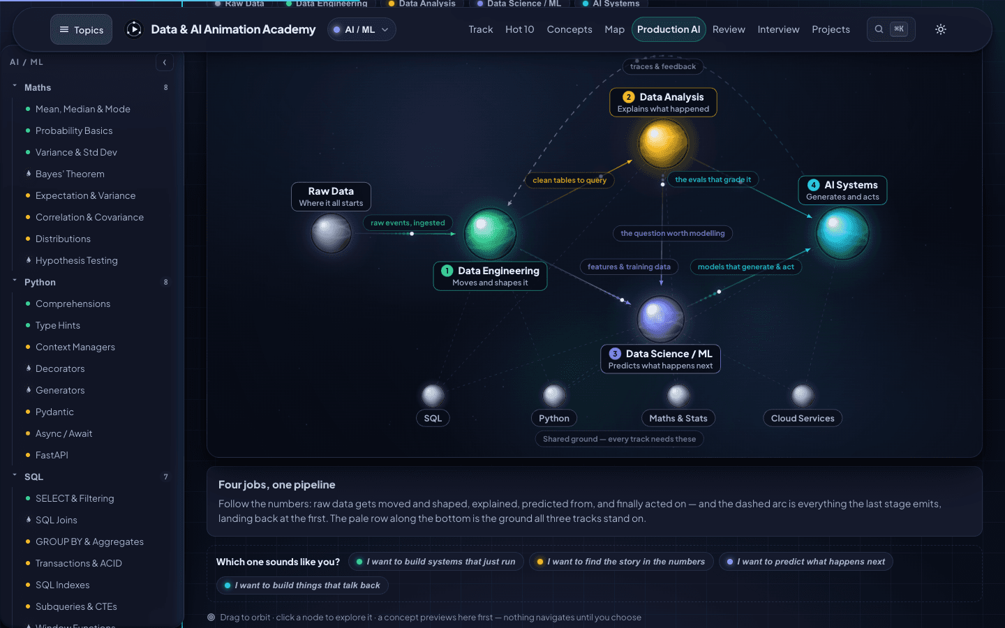
See how the jobs connect
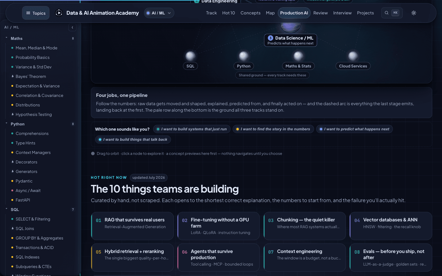
An interactive map shows raw data moving through engineering, analysis, machine learning and AI systems. Click a role to see its lanes, a lane to see its concepts.
What teams are building now
A hand-curated Hot 10, updated July 2026, from retrieval that survives real users to guardrails against prompt injection.
Try it
This is the Academy's teaching style applied to one idea: how a chatbot finds the right paragraph before it answers.
How a chatbot finds the right paragraph
A four-step explainer in the Academy's style. Use the buttons, or just watch.
Step 1 of 4
Split the documents into chunks
A long policy document is cut into short passages, each small enough to read on its own.
How it works
Pick a track
AI/ML, data eng., analytics
Open a concept
From the map or search
Watch
A two-minute build-up
Interview answer
What to say
Production note
How it fails
Why animation works for hard ideas
Text describes a system after the fact. Animation shows it changing: a value moves, a vector rotates, a queue fills and drains. When people see cause and effect one step at a time, they remember it.
Each concept follows the same shape so learners always know where they are:
- The build-up. One idea, added a step at a time, never more than one change on screen.
- The answer. How to explain it in an interview, in plain words.
- The failure. What goes wrong when it runs in production, and how teams notice.
What this means for your business
Your product, onboarding or internal process can be explained the same way. If your sales calls turn into whiteboard sessions, or new hires take weeks to understand how things fit together, an interactive explainer does the explaining for you, at the viewer's own pace.
Tech specs
- Concepts
- 208 in total: AI/ML 157, data engineering 50, data analytics 37 (tracks share concepts)
- Format
- One animation per concept, about two minutes each
- Also inside
- Curriculum map in dependency order, interview prep, project ideas, production notes
- Navigation
- Interactive pipeline map and ⌘K search
- Price
- Free
- Built with
- Vite, JavaScript, GSAP, Canvas
- Hosting
- Vercel
Want something like this for your business?
Tell us what eats your team's week. You'll get a written scope with a fixed price and timeline before any work starts.